Check these photos out on Flickr—————————->
They look much better on the white background.
Original photo, simply cropped with a frame added:

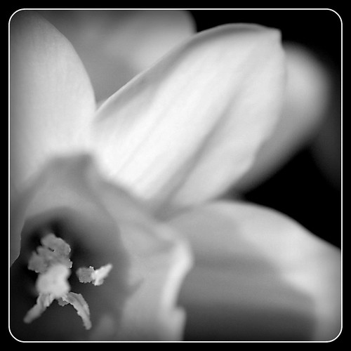
And converted to black and white:
Check these photos out on Flickr—————————->
They look much better on the white background.
Original photo, simply cropped with a frame added:
And converted to black and white:

Very pretty! I definitely prefer the color!!!
Love the new header, too!
I love both! Each has their own “something”. Wait until things start blooming! You will have to come over and get shots of my flowers in the spring/summer. Oh, and my neighbor has some peonies that bloom in June. I took some really cool shots with my “simple” camera last year.
Both are a great shot…flowers are interesting in B&W especially when they are know for such a specific color like the daffodil you have captured.
Removing the expected color from the bloom draws the viewer’s eye to the lines and texture variation within the flower. I know I marked the color version as a favorite on flickr because it is a terrific color macro with lovely DOF. I wonder if you tried to force a more shallow DOF on B&W compositions of flowers what kind of series you would have. Truly, the color is the common thing amongst all daffodils, but each one has it’s own unique line and texture…even a rip in a petal becomes the stamp of individuality.
Hmmmmm….you gave me an idea friend…How about a mini-challenge? A series of unique character sketches of flowers. They must be the same type of flower within each series, so you could do daffoldils or roses, I could do tulips or carnations. ALL must be done as B&W to look for the unique character in the structure of the flowers. And we post them here like Monday-ish.
WHAT do you think?
LOVE the idea!!!!! I’ll send out the word! 🙂