Crazy Beautiful!!! 🙂 What a gorgeous color! I wonder if those puppies would survive in my Zone 4? lol Yeah, right! I still have freaking snow outside my window…It’s the end of March and not a single crocus has even peeked out. Cripes.
daliaMarch 24, 2009 / 10:31 am
Wow!! The yellows and oranges are just so pretty!!
The last one is just amazing!!
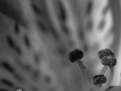
It’s funny…the color and then lack there of it really does change the mood of each image.
Take for example the very first bloom. To me the color version, is a story of this flower basking in the rich white hot glow of light. The B&W version really forces my eye to look for the light. The bloom appears to be yerning, leaning to gather the light with the edges of it’s petals to feed the whole plant; a moody story of survival.
I meant to add the shots are SOOC – I didn’t play at all with the color of them. I think the color of those tulips was particularly photogenic which made it extra difficult for me to strip it away!


Love them in color!!! You did a great job with the conversions, though.
Here are mine in color:
These are simply gorgeous! I can’t even compare them because each set has it’s own appeal. 🙂
My color Azaleas were in the first post, but here’s the color Camelia. So different, to me.
Crazy Beautiful!!! 🙂 What a gorgeous color! I wonder if those puppies would survive in my Zone 4? lol Yeah, right! I still have freaking snow outside my window…It’s the end of March and not a single crocus has even peeked out. Cripes.
Wow!! The yellows and oranges are just so pretty!!
The last one is just amazing!!
Thanks Dahlia! They really are a pretty bunch.
It’s funny…the color and then lack there of it really does change the mood of each image.
Take for example the very first bloom. To me the color version, is a story of this flower basking in the rich white hot glow of light. The B&W version really forces my eye to look for the light. The bloom appears to be yerning, leaning to gather the light with the edges of it’s petals to feed the whole plant; a moody story of survival.
Oh, wow…I think I have to look more closely. 🙂
I definitely noticed the light and shading more in the black and white. Good training for the eye.
I probably don’t even have to announce my love for the color shots to this group, but I will anyway!
Here’s my shots with the color versions added:
http://picasaweb.google.com/karmardav/BlackAndWhiteFlowerChallenge?feat=directlink
I meant to add the shots are SOOC – I didn’t play at all with the color of them. I think the color of those tulips was particularly photogenic which made it extra difficult for me to strip it away!